

WebPerformer V2.5.2 でカスタムUI部品を作成する
はじめに
こんにちは。エヌデーデー島村です。
WebPerformer V2.5 で 追加された「UIエディタ」ですが、WebPerformer V2.5.2 では「UIエディタ」で使用できる「カスタムUI部品」という機能が追加されたので早速使ってみました。
今時のちょっと凝った画面を作るのに良さそうです。
SPAアプリケーションの作成
UIエディタ使用したアプリケーションを作るには、まず、WebPerformer のアプリケーションを SPA モードで作成する必要があります。
プロジェクトを右クリックして、[新規]>[新規アプリケーション]を選択します。
新規UIのダイアログが表示されるのでアプリケーションタイプで「SPA」を選択します。
カスタムUI部品の概要
カスタムUI部品を作成することで、標準部品にはない画面機能を実装することができます。
Reactで作成されたカスタムUI部品をUI定義で利用することができます。
カスタムUI部品の定義
カスタムUI部品はJavaScript形式で定義し、ファイル名をdefinition.jsとする必要があります。
カスタムUI部品の情報を定義した部品定義オブジェクトを戻り値とするJavaScript関数を記述します。
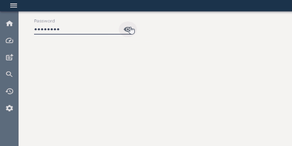
下記の例では、アイコンをクリックすることで表示/非表示を切り替えることができるパスワード用のフィールドを定義しています。
function PasswordField() {
  return {
    key: 'password-mask',
    name: 'カスタムパスワード',
    extends: 'CustomComponent',
    handlers: {
      onMaskClick: {
        action: 'maskClickAction',
      },
    },
    actions: {
      maskClickAction: {
        name: 'パスワードのマスク変更',
      },
    },
    editSetting: {
      defaults: {
        customProps: {
          mask: true
      },
      dataType: 'ANY'
      },
    },
    generator: {
      dependencies: { '@material-ui/core': '4.9.9', '@material-ui/icons': '4.9.1' },
      imports: [
      {
        import: ['forwardRef', 'useState', 'useCallback'],
        from: 'react'
      },
      {
        import: 'InputAdornment',
        from: '@material-ui/core/InputAdornment',
      },
      {
        import: 'IconButton',
        from: '@material-ui/core/IconButton'
      },
      {
        import: 'TextField',
        from: '@material-ui/core/TextField'
      },
      {
        import: 'VisibilityIcon',
        from: '@material-ui/icons/Visibility',
      },
      {
        import: 'VisibilityOffIcon',
        from: '@material-ui/icons/VisibilityOff',
      },
      ],
      source: `
      forwardRef(function (props: any, ref: any) {
        const {
	      width,
	      height,
	      margin,
          customProps,
          onMaskClick,
          onCommit
        } = props,
        [mask, setMask] = useState(customProps.mask),
        onBlur = useCallback(() => onCommit(), [onCommit]);
        return (
          <TextField
          id="password-input"
          label="Password"
          type={mask ? 'password' : 'text'}
          autoComplete="current-password"
          InputProps={{
            endAdornment: (
              <InputAdornment position="end">
                <IconButton edge="end" onClick={() => {
                  const nextMask = !mask;
                  setMask(nextMask);
                  if (onMaskClick) {
                  onMaskClick(nextMask);
                  }
                }}>
                  {mask ? <VisibilityIcon /> : <VisibilityOffIcon />}
                </IconButton>
              </InputAdornment>
            ),
          }}
          inputProps={{
            maxLength: 10,
          }}
          style={{
            width,
            height,
            margin
          }}
          onBlur={onBlur}
          />
        );
      })`,
    },
  };
}
カスタムUI部品定義を指定のディレクトリに配置
定義したカスタムUI部品は以下の指定されたディレクトリに配置する必要があります。
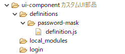
WebPerformerプロジェクト/ui-component/definitions/{key}/
※ {key}にはカスタムUI部品の定義のkey:に設定した値が入ります。
カスタムUI部品の配置
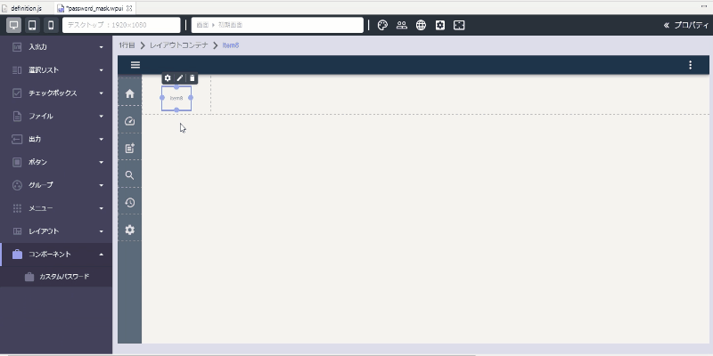
定義したカスタムUI部品はパレットに表示されます。ドラッグ&ドロップまたはクリックすることで、UI部品をレイアウトキャンバス上に配置できます。
プレビューの表示
まとめ
V2.5.2の新機能であるカスタムUI部品を作成することで標準部品のみでは実装できない、自由度の高い実装ができるのではないでしょうか。